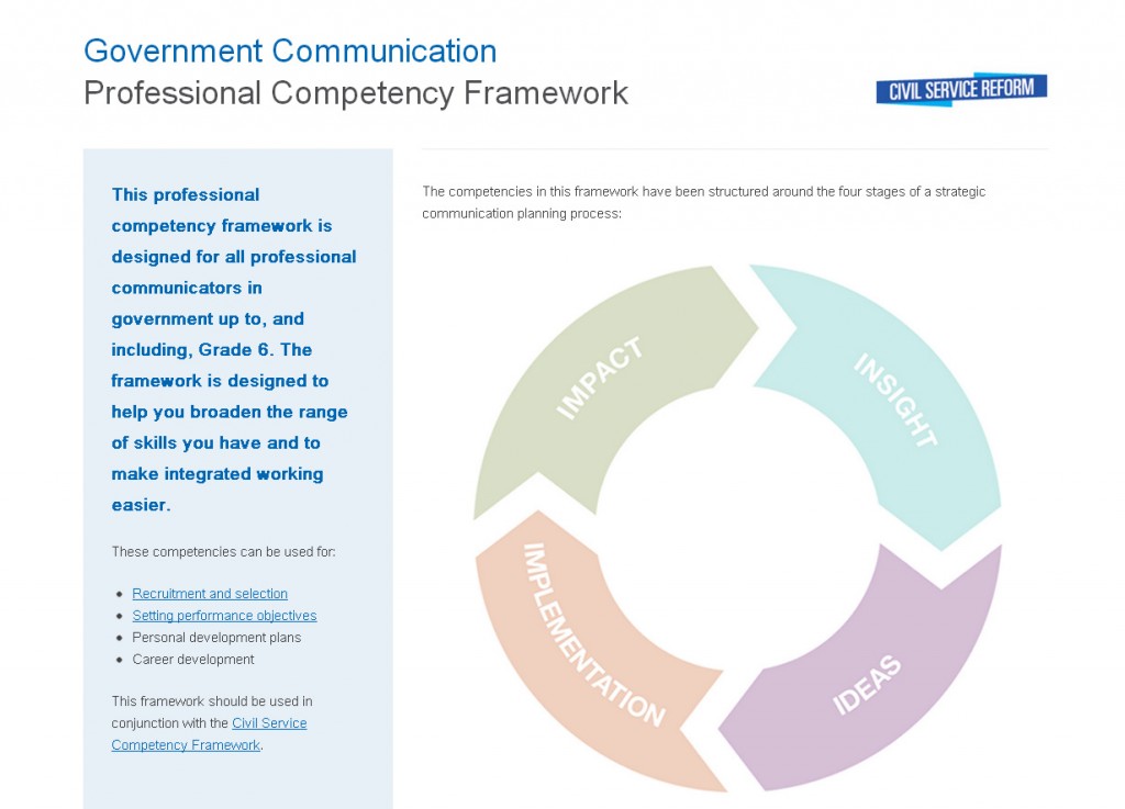
An interactive tool for GCN’s Competency framework
The Government Communications Network have blogged about the interactive pages we designed to help them present their new professional competency framework. You can see the pages here, but it is interesting to look at the ways in which this sort of design work is becoming a bit more common across government digital.

Portable Document Format
While the PDF may have been agreed as an open document standard in 2008 after a long period in the proprietary wilderness, it is still roundly pretty roundly despised by users. It is the Flash of documents, the Silverlight of official forms and the Java Plugin of graphically designed text and images. If you’re on a mobile, you can kiss your data allowance goodbye when you have to start downloading any amount of these, and add on top of that that there are very few mobile readers that don’t make your processor glow hot like a comedy radioactive filament.
Even on desktops the story isn’t a lot better. Web teams often (though not always) get a slightly better set of IT to work with than other departments. That can sometimes lead to a forgetfulness that not everyone using the website is running a behemoth of a machine, and that some users can find their PDF load times will measure in minutes rather than seconds. This is a pretty good reason to avoid them if at all possible, never mind because of all the better things that can be done with information online.
Government of all shades has been guilty in the past of treating the internet as a large storeroom for documents rather than an interactive experience for the user. Think of the warehouse at the end of Raiders of the Lost Arc for an idea of how documents were treated across officialdom; another one wheeled in and placed on a rack to gather dust.
PDFatigue
But, we’ve started to see a bit of a change in the last few years from loads of directions: firstly, as ever, GDS changed the rules on how government works online and started treating the user as engaged and intelligent. But elsewhere there have been smaller rebellions about this as people have started to realise the limitations of uploaded documents. This year we’ve seen House of Lords select committees upload reports using only web pages and youtube videos instead of a lengthy and often poorly-read PDF.
What did we do?
This brings us our work on the GCN competency framework: this is a fantastic set of professional development tools for professional communicators throughout government to see the standards they should be meeting and how to progress through training. That is exactly the sort of information interaction that the web was built for, and in the past it was exactly the sort of thing that would have been relegated to a PDF.
What we’ve created instead is something interactive, that presents an intuitive user journey and makes the information the star rather as opposed to the medium getting in the way.
With a project like this it is important to keep the user at the heart of the interaction. Lily has been talking about this recently and it is something that we keep at the heart of what we do. Taking information that used to be flat and making it something that a government communicator would want to read is more than just intuition, it is a process with stages, iterations, questions and answers.
We’ve been working on this approach, taking our lead from the Service Design Manual and we’re keen to keep looking at it and iterate the way that we work to make information interactive.