The WordPress editing window
If you’re a content focused person, there’s a good chance you spend quite a lot of your time in the WordPress editing screen.
The main focus of this screen is of course the editing window – that sometimes rather intimidating box that you fill up with words, links, pictures and videos to create your posts and pages.
It’s quite a flexible thing though, that box. You can stretch it up and down to make it as big or as small as you like.
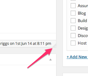
Just take a look in the bottom right of the editing window and you ought to see three diagonal lines in the corner.

Click and hold on that, and you can move the bottom of the window up and down to resize it. Simple.
Another way of writing in WordPress is the full screen editor. This makes the editing window take over your whole browser tab, removing all the distractions of the usual WordPress interface. All you get is a white screen with the content of your post or page on it.
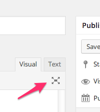
To access the full screen editor, you just need to click the icon on the far right of the toolbar on the editing window. It’s usually just under the ‘Text” tab.

To get out of full screen mode, you’ll need to wiggle your mouse a bit, which will bring up the few options you can access on this display, and click the ‘Exit fullscreen’ link on the far left of the toolbar.
How do you like to write within WordPress? Any other tips for our readers?