Beyond slide decks and reports
Beyond slide decks and reports: Running workshops to share research findings and help others apply design thinking

We recently worked on a discovery project with the Government Digital Service (GDS) to improve the tools and systems that support the Cabinet Office spend controls. We worked with the Standards Assurance team at GDS, who are responsible for approving digital and technology spend across government. They’re one of the nine Cabinet Office functions that were set up in 2011 to help reduce wasteful spending.
This team at GDS act as the gatekeepers for approving digital and technology projects across every government department and more than 300 public bodies. It’s mostly made up of technical advisers, who together review over 500 spend requests every year.
The main goal of the discovery was to understand the needs of GDS technical advisors and evaluate the tools they use to manage their work. We also conducted research with assurance teams in different government departments and agencies to understand how they navigate through the spend approvals process.
We found that user needs and the process for approving spend have evolved over time, but the tools and systems to support the service haven’t. With this in mind, we’ve been working with GDS to understand what different users need, and how we can make the spend controls process work more efficiently for everyone.
Using co-design to visualise opportunities to meet user needs
Towards the end of our discovery, we had uncovered a set of unmet user needs and shared pain points across multiple user groups. We also identified several design opportunities that could benefit GDS technical advisors who have to assess cases, and have a flow-on effect on departments who are seeking spend approval for their projects.
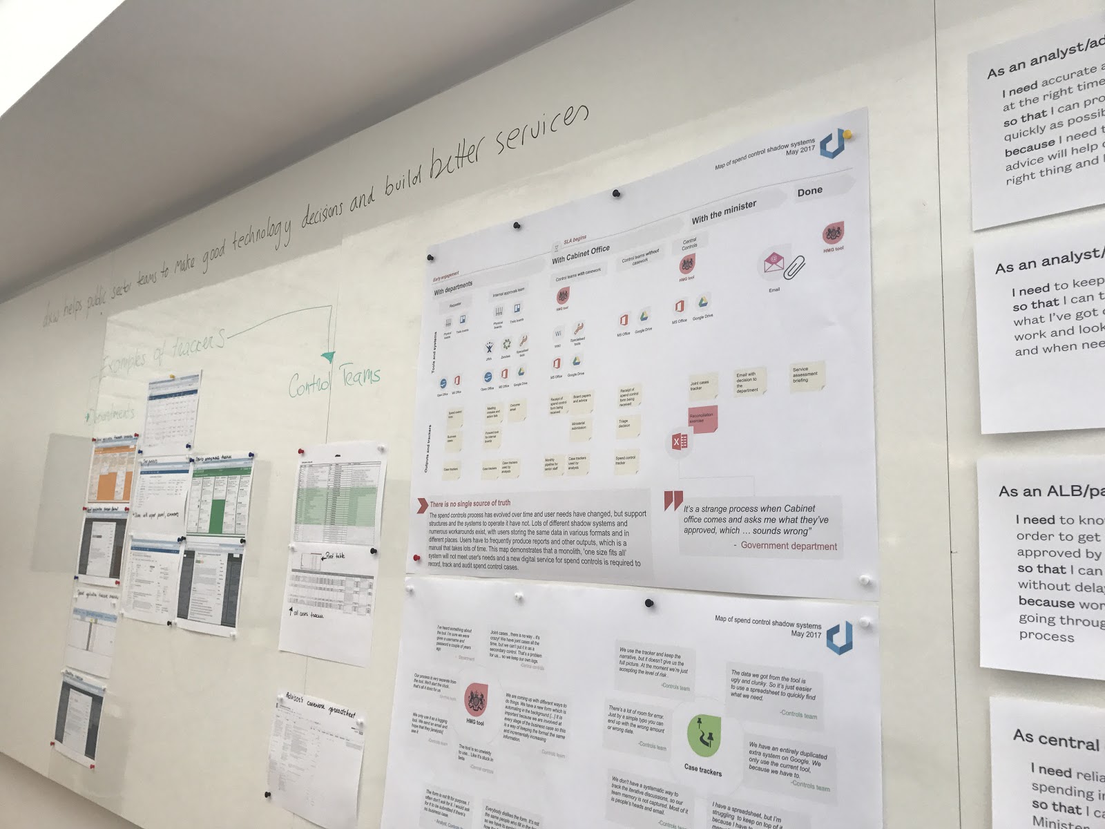
Inspired by research walls and mini research museums, we decided to run two co-design workshops. We invited GDS technical advisors to the sessions and asked them to re-imagine the process of approving spend and the tools that they currently use.
To get people in the room in the right mindset, we selected a few visual prompts. These included:
- the main user needs for each user group
- a map of the shadow systems currently being used to operate the spend controls process. This demonstrated the workarounds that people have created to support their work, on top of tools they are meant to use
- images and screenshots of some of the shadow systems used, to demonstrate how data is duplicated in different formats and systems
- user voices (in the form of quote clusters) which highlighted the pain points and areas of friction shared by different user groups.
Addressing shared challenges
To help us validate our research findings and build a prototype at the end of the discovery, we ran two workshops with 3-4 people in each group.
In the first part of the workshop, we asked technology advisors to sketch out a dashboard they could use for their day-to-day work. We got participants to present their drawings to others in the room and discussed it afterwards.
After a break, we completed another exercise, where technical advisors had to decide on the minimum amount of information they need to quickly review a spend request. We also asked them to agree in what format they preferred this information. We knew this was particularly challenging because of the difficulties users experience with the spend control form, as well as the case-by-case nature of applications.
Developing a user-centred mindset and a collective sense of ownership
By the end of the workshops, we had shared the main research findings in such a way that was more engaging than a monologue from the team. More importantly, we were able to share our vision of what to do next with the project in a way that was empathetic to everyone’s needs. This also helped our designer understand user needs in more detail and become embedded in the work more quickly.
At the end of discovery we still shared our findings and recommendations at a show and tell, but we also presented user journey maps and two functional prototypes. This left GDS with some actionable findings that would be ready to be tested and iterated in a future alpha phase.
As a result of this work, we were able to build trust with our users and clearly demonstrate the value of actionable user research.
Some tips for running co-design workshops:
- Be mindful of all participants and make sure the group is well-balanced. Are there any team dynamics that will affect how honest and open people feel they can be? Is there someone who is likely to dominate the conversation?
- Space and timing are important, so have plenty of both. Set aside extra time for a proper introduction and regular breaks so that people can walk around and have a closer look at visuals before you get started
- Select prompts carefully so that different user groups and the context that is important to them is well represented, but does not overwhelm them
- User needs are the most important output. If you feel you don’t have enough prompts, spend your time writing clear user needs and only pick the most important ones for the research wall
- Encourage people to create and share ideas. Sketching and co-creating doesn’t come naturally to most people so encourage them that no idea is a bad idea
- Arrange the room in a way that everyone can see the prompts and refer back to them as they sketch, co-create and discuss.
Co-design workshops are great when you have to balance competing user needs
We’re always looking for better ways to work, particularly where we can be more transparent and collaborative with user research findings. Conducting agile research requires us to work fast, include the whole product team and give clients opportunities to get involved.
This workshop really helped achieve this outcome and we’d encourage others to use a similar approach when working on discovery projects.