Our visit to the Digital Accessibility Centre for CCS Crown Marketplace

The feedback and recommendations from DAC were hugely valuable
We have been working with the Crown Commercial Service to develop a new service for schools to find supply teachers and other agency staff. The new commercial deal helps schools get value for money and avoid fees for things like transferring temporary staff into permanent roles.
Working as a single, multi-disciplinary team with the Crown Commercial Service and Department for Education, we’ve been building the service in an agile, iterative way to ensure we meet the needs of staff in schools who will use the service. Accessibility is a crucial part of this, so in our final beta sprint we asked the Digital Accessibility Centre (DAC) to carry out an accessibility audit for the service.
While the DAC team provide a report at the end of the audit, we also took the opportunity to visit the centre in Wales to observe their usability testing. Here’s a summary of what we learned when the testers used the service on five assistive technologies.
Voice recognition software – Dragon
The first task involved testing the service using Dragon, a voice recognition software. A member of the DAC testing team demonstrated how they would interact with the service using Dragon, without traditional input devices like keyboards and mice. Dragon allows the user to scroll the pages, click links and buttons, select radio buttons and even perform text input by using voice to communicate with the service.
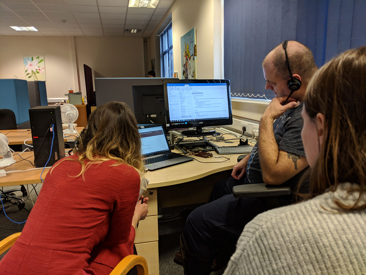
Findings from the task:
- there were no significant usability problems found
- the design of the distance selector on the suppliers listing page was easy to use
- the spreadsheets we have downloaded links for do not work well with Dragon and we should use HTML where possible
Screen reader – VoiceOver
The next task was done by users with visual impairments with the aid of VoiceOver, a screen reader designed by Apple for Mac OS and iOS. With the help of VoiceOver, the users navigated through the elements on the pages by using the Tab key on desktop and a gesture on iPhone. VoiceOver reads aloud the content or the name of the elements (e.g. text input / radio button) so that users can understand it without looking at the page.
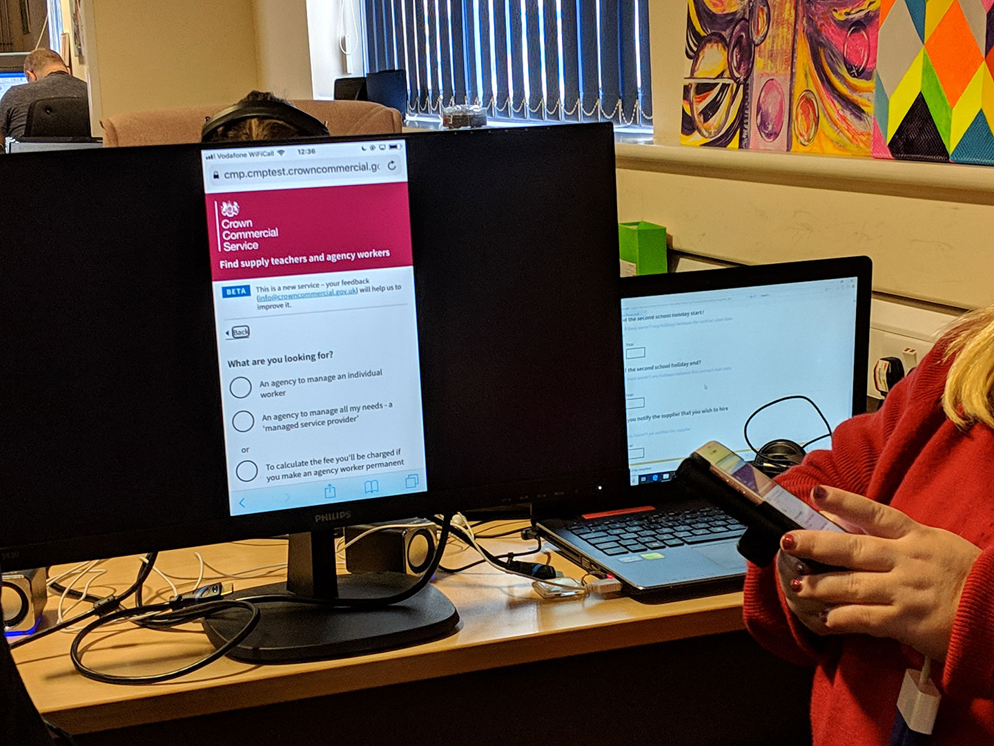
Findings from the task:
- the questions and input fields on the service are well labelled
- our hints for input fields are very helpful
- our error handlings are excellent
- the “Back” links we’re using can be improved by having a better aria-label
- tables may be visually good but could be tricky for some users if headings of rows and columns are not well labelled
- pages with too many optional input fields could be difficult for users to navigate
Users with dyslexia
We also tested our services with the help of users with reading difficulties. From this, we learned that users prefer moving images to lots of static textual content. However, users found that our service is easy to use.
Findings from the task:
- some paragraphs of content on the service are broken down to bullet points, which helps users understand what they need to do
- we’ve used a good font size for text, which makes it easy for users to read
- tables are very useful for displaying information
Users with central vision only
During our visit, we also carried out testing with users who have relatively narrow vision. In most cases, they can only see content in the middle of the screen. That means if related content is positioned too far away from each other then it can be easily missed.
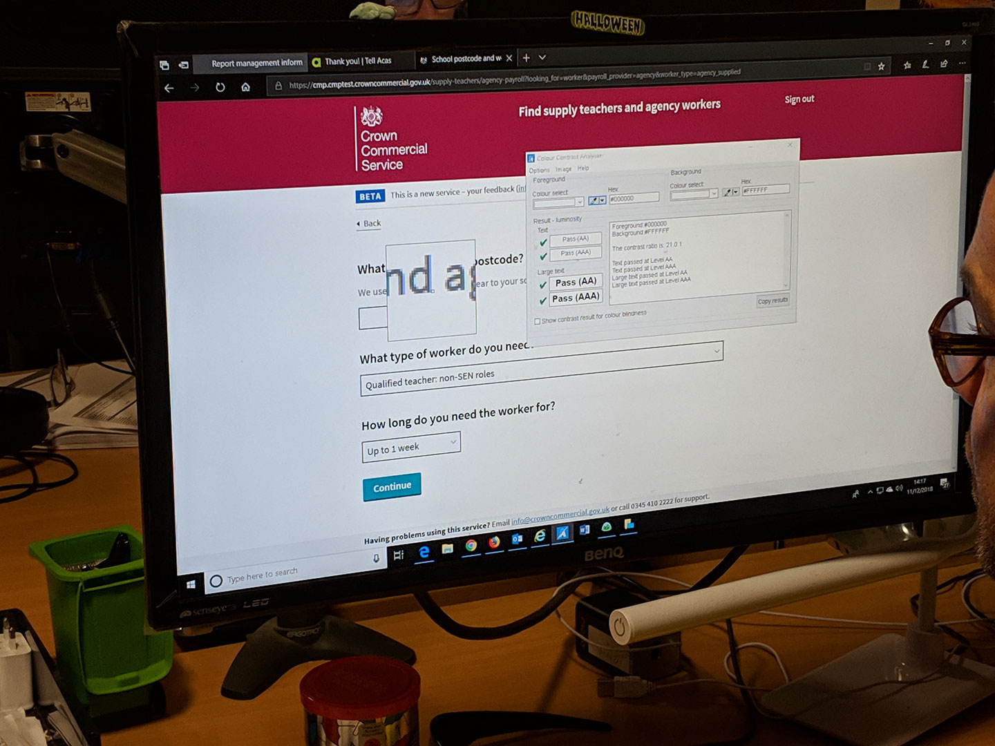
Findings from the task:
- radio buttons should be highlighted with bigger hotspots so that users can see a more obvious change of state
- visual cues are needed for links and email addresses for hover states
- the grey hints text (provided by GOV.UK Design System) have a low contrast against white background
- the arrow at the right-hand side of dropdown menus could be easily missed as there is too much white space between the text and the arrow
- some font sizes are too small
Users with visual impairment caused by glaucoma
The final session of the day was with a user who had lost most of his vision as a result of glaucoma. ZoomText and Audible are the main tools used by users for web navigation. The white background and black text page colours on the service were inverted in his setup so that he could read with less difficulty. Text is configured to enlarge to a very large size too.
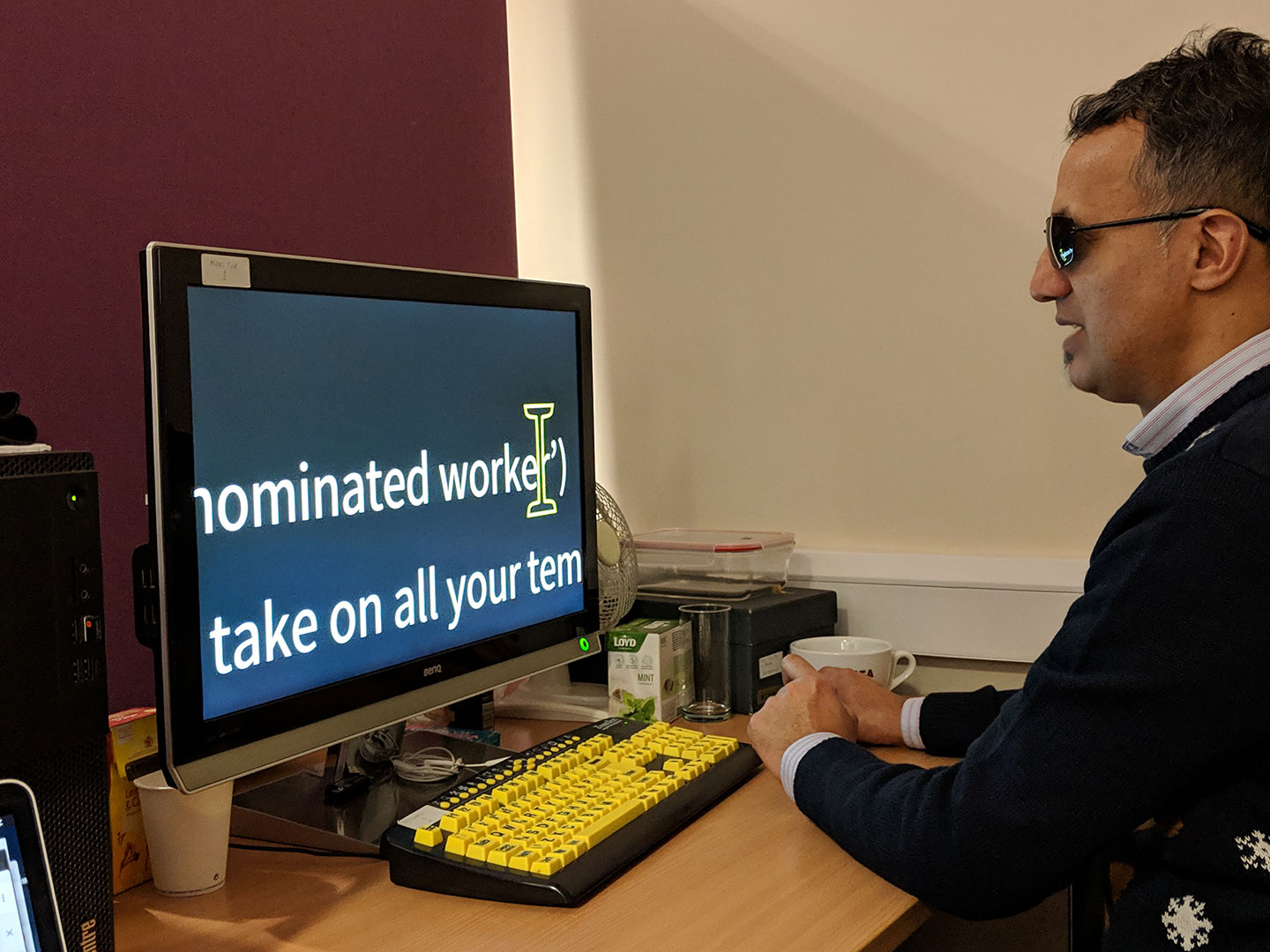
Findings from the task:
- since text is hugely enlarged, white spaces are also hugely enlarged as a result. Related materials that are not placed together closely are easy to be missed
- thin text is hard to read
- content is positioned properly
- line breaks and bars are useful as it reminds the users about the end of a section
- error messages are clear
- document links could be improved by adding the file format (e.g. .pdf / .doc) to the end of links
How we got on
In addition to our direct observations while visiting DAC, we also received a detailed audit report. The summary of the report is below:
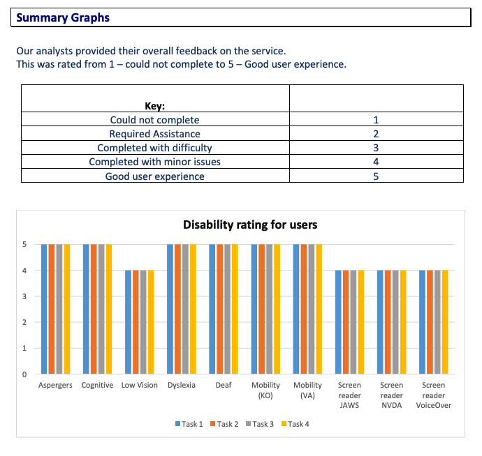
It was very encouraging to score such high marks, particularly for a service which we designed and developed in less than 6 weeks. The feedback and recommendations from DAC were hugely valuable and we’re now iterating and improving the service so it works well for all users.