Some alternatives to using personas

It’s only right that as a product or service evolves, the methods we use do too
User-centred practices rightly demand that we make sure the user (person!) using a service is considered throughout design and development. We ask user researchers to find out more about what people are doing and thinking, and what contexts they would be using our services in.
Our challenge is then how we share what we’ve learned in an engaging and tangible way. The default for many projects tends to be personas. I’d like to talk about some other tools that can do the job instead.
Think about what you need to communicate
There is a place for personas, but we’ve used other methods that we found more useful in different circumstances. This includes things like:
1) User cards
With the Government Digital Service and the Small Business Commissioner, we created user cards. Each card represented one type of user, supported with a quote and a list of core user needs. The benefit of these is that they were quick to produce, and they gave a snapshot of the most important things we needed to consider for each user type.
The user cards were printed for our research walls in one project and used as part of a handover for another. They focused on validated user needs across a unique group of users. We ensured insights were memorable and human through the use of composite quotes. Generally, the cards were kept at quite a high level, as the rest of the information typically included with personas would only add noise and quickly become dated.
2) Switching forces framework
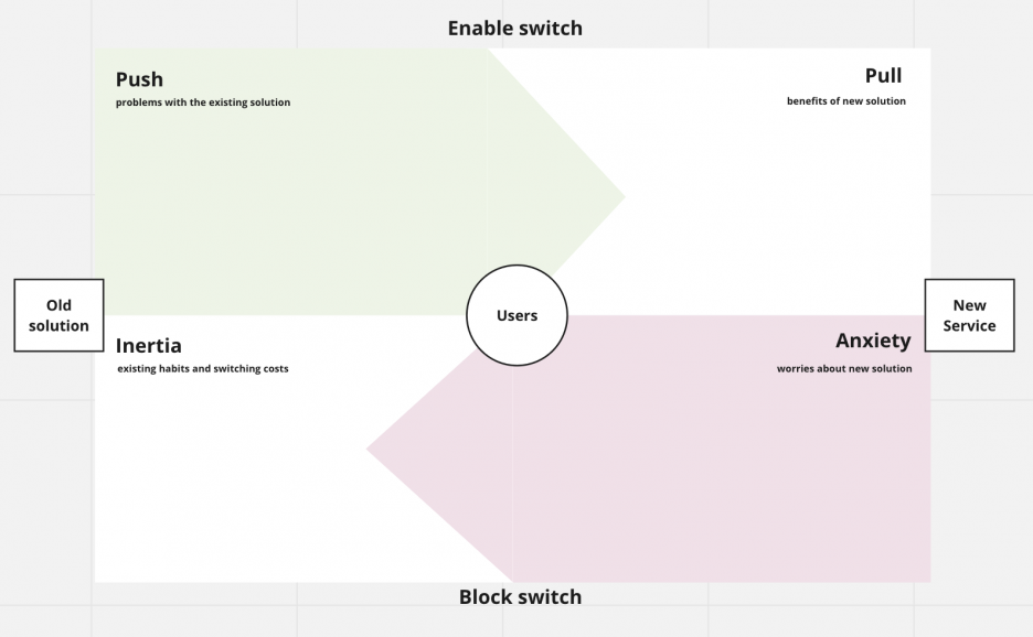
With the Crown Commercial Service we used the switching forces framework to map our user data. This focuses more on how an organisation can use the insights you have. User needs, motivations and behaviours are organised around questions:
- how do we encourage people to use a new product/service (remove pains, create gains)?
- how do we reduce blockers to using a new product/service (break habits, remove anxieties)?

Maintaining a spotlight on underlying user needs
We recently completed a project with Ofsted where we were asked to focus on parents (and guardians) to understand how and why they contact Ofsted. The audience was broad. It included parents of pre-school, primary and secondary school age children across the country and the full range of socio-economic backgrounds, ages, use of technology and so on.
We interviewed 16 parents in 2 sprints to find out what they thought Ofsted was for, and how they would prefer to contact them in different scenarios. When we shared our findings, we focused on the goal that parents were trying to achieve first. These goals were supported by insights through journey maps, regular show and tells and engaging research findings using quotes and videos to back up our analysis.
Using a matrix to establish the extremes of behaviour
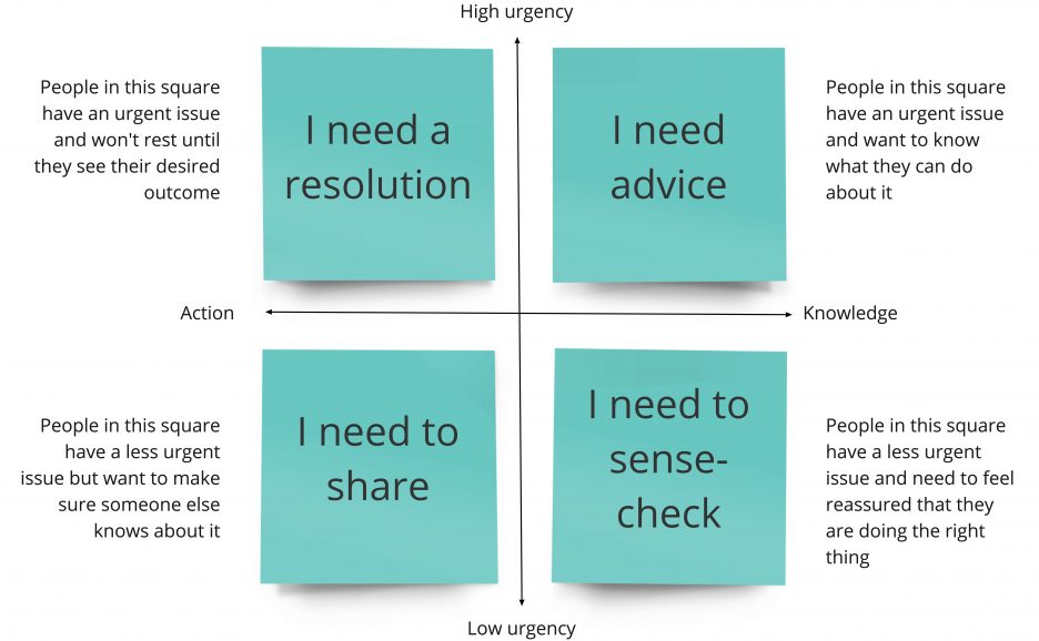
We presented the user needs using 2 axes; motivation, and the urgency of the issue. Depending on these factors, parents would act in different ways and have different expectations of what Ofsted could do for them.

The grid enabled us to keep underlying user needs at the centre of decisions. And by providing solutions that covered the extremes, we also covered everything in between. When we presented this to the Ofsted team, it reflected activities and behaviours they had experienced with parents themselves. It immediately gave them faith in the research, and the simple structure was easy to understand and share.
Underlying needs won’t change
One of the reasons this approach worked so well was because we were working on a discovery. We hadn’t yet established what the problems were that needed to be solved, and we definitely didn’t know what the solutions needed to be yet.
As with the “jobs to be done” theory, these user needs will largely remain the same, but the ways in which they are provided for will develop over time. The matrix keeps the focus on user goals and provides space for teams to identify knowledge gaps to keep their services up to date and fit for purpose.
Evolving our methods with the product or service

It’s only right that as a product or service evolves, the methods we use do too. Taking our 2×2 grid as a starting point, there are a few ways this could develop as we learn more. Some ideas include:
1) Establishing priorities for the organisation
Which of these needs is causing the most difficulty to users of the organisation? Which is currently costing the most to support? Which is the easiest to implement change for?
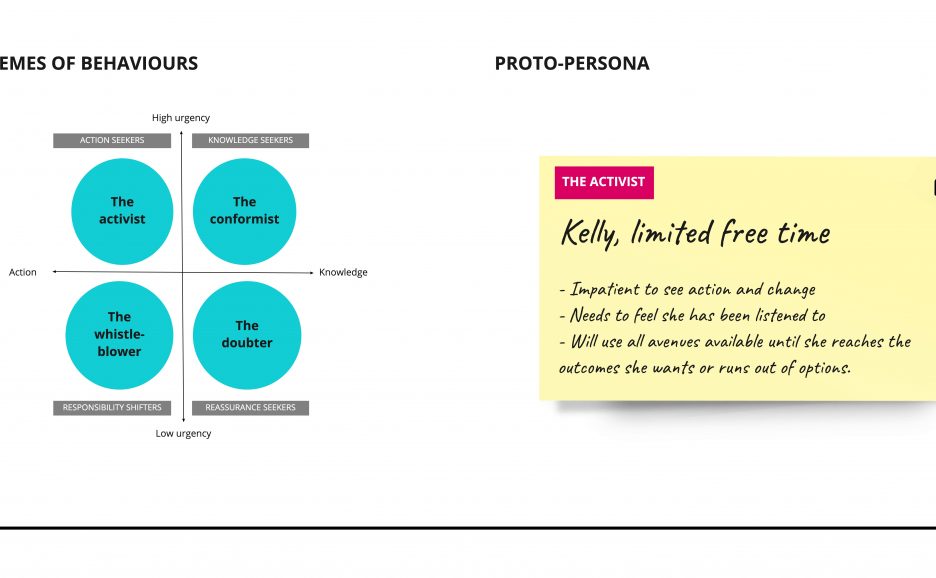
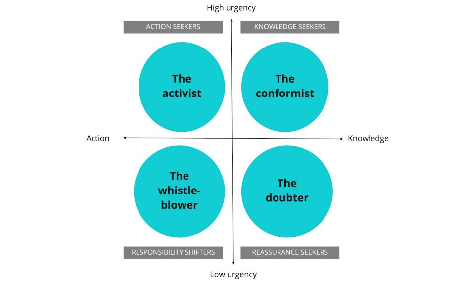
2) Developing archetypes of behaviour
Archetypes represent how someone might behave, which could help humanise the grid and make them more memorable e.g. “The activist” becomes frustrated when they don’t feel their issue is being resolved quickly. We used this approach with GDS, where each archetype was developed into handy cards that highlight key user needs.

3) Using the grid to evaluate solutions
Sense check our ideas to make sure they are addressing user needs before they get developed further i.e. is this actually something we need to provide? Is there a need we haven’t addressed at all?
There is a place for personas
I’m not ruling out the use of personas altogether. In some cases, teams may find value in a more detailed persona to help make decisions on how to implement a solution. This should go hand in hand with more focused research to support the exploration of the idea. It’s important to remember that personas should be an evolving tool that keeps being updated as we learn more.
If you’d like to find out more, or have ideas you’d like to discuss, please get in touch.