Prototyping with slides

The less the tool gets in the way, the better
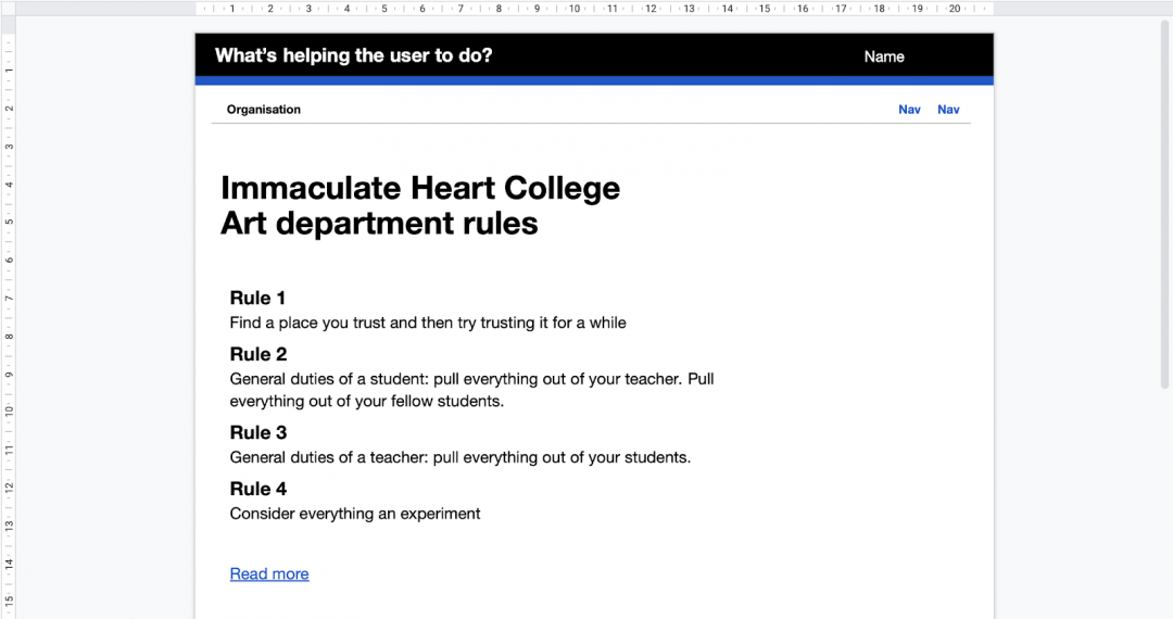
Last week we had to quickly prototype some ideas remotely with a client. They didn’t have any experience of prototyping or access to video conferencing tools. So we decided to send over a PowerPoint template for them to play with.

Here’s 3 things that are useful about using slides for this type of work.
Everyone can contribute
Prototyping helps to explore and communicate different ideas, the less the tool gets in the way, the better. Google Slides or PowerPoint are familiar things that most people can use, so it’s quick and easy to get started.
Even though Figma has done an amazing job at being easy to use, it’s still pretty technical. If you’re not used to design tools, they can add friction that either excludes or frustrates people because they can’t do what they want to do.
Scarcity forces deeper thinking
In a slide deck, you don’t have fine controls and that’s a good thing. As there aren’t many options, it forces you to distill what the page or flow needs to do.
Sometimes design tools make you worry too much about things that you might not need to (at that point).
It’s easier to throw away
Because it’s a tool people are familiar with and understand what it takes to make something, they aren’t so precious about the prototypes and ideas.
It’s easier to throw them away and start again. It’s easier to iterate.
My experience with code is that it’s sometimes harder to let go or to think differently.
When to use slides for prototyping
I’ve found this most useful when you want to figure out an idea or a flow with others. Especially at that first stage when you want to test the utility of some ideas.
It can’t be really clever as you can only link to slides or pages, and it definitely has its limits.
Here’s a template with some elements if you want to give it a go: PowerPoint template for prototyping
I’d love to hear how it goes.