Progressive enhancement: why we build things from the ground up

As more and more public services have moved online, having a slow internet connection can put you at a real disadvantage
Unless you’ve always had the privilege of an ultra-fast fibre internet connection, you’ll know the pain that comes with a dodgy connection. Turning the router on and off again, refreshing and re-refreshing your browser to get your fix of cat videos, and being greeted with a slow loading page, possibly with some broken images that don’t display.
It can be incredibly frustrating. Even more so if the website you’re trying to access isn’t for cat videos but for sorting your council tax bill, registering to vote, or something even more urgent like getting the council to repair a problem in your house. As more and more public services have moved online, having a slow internet connection can put you at a real disadvantage. What if you’re unable to pick up the phone or find another offline alternative to accomplish tasks like this?
As builders of digital public services, it’s our responsibility to make sure that what we put in front of users works for everyone, regardless of the speed of their internet connection or other technical issues that might arise. Everyone should be able to access the essential services they need online.
A bit about the work I do as a developer at dxw
For the past year, I’ve been working with the Ministry of Justice (MOJ) on the user interface component of “Refer and Monitor an Intervention”, a service for Probation Practitioners to schedule people on probation onto “interventions”. Interventions are rehabilitative programmes that aim to reduce the risk of reoffending.
Before working at dxw, most of my development work was “full-stack”, covering both what you see in your browser (the frontend) and the underlying data sources behind the scenes (the backend), but with a heavy lean towards the backend side of things like databases, rather than the user interface side of things.
I’d written my fair share of HTML (the basic building blocks of a website), CSS (used for adding colours and styles to a page), and JavaScript (for adding interactive behaviour), but didn’t focus heavily on keeping up to date on the latest frontend technologies.
Since joining dxw however, I’ve worked on mostly frontend-heavy projects, including Hackney Council’s Manage a Tenancy service, Mind’s online community called Side by Side, and now, MOJ’s Refer and Monitor an Intervention service. Until recently, I’d always thought of frontend development as being about building a slick user interface with the latest technologies available.
What happens if your users don’t have the fastest internet, the latest technologies, or something goes wrong with your flashy scripts?
There are a bunch of different ways CSS and JavaScript can fail. A script might not have finished loading, or fail halfway through loading due to a network outage. Users might choose to turn JavaScript off (you can disable it in your browser fairly easily in the settings). They might be using an older browser. There are a number of reasons for these types of problems.
Parts of your service could fail to load, essential information may not be displayed to users, the user journey may be straight up broken, or users might not be able to use your site for their needs at all.
How can we protect against this and make our services resilient when things might go wrong?
Enter progressive enhancement
One of the design principles we’ve been following closely on Refer and Monitor is “Progressive enhancement”. Progressive enhancement is a way of building web services following the Rule of Least Power, a design principle by which you write your software in the least powerful language, rather than the most powerful. As Tim Berners-Lee puts it in Principles of Design:
The less powerful the language, the more you can do with the data stored in that language. […] If, for example, a web page with weather data has RDF describing that data, a user can retrieve it as a table, perhaps average it, plot it, deduce things from it in combination with other information. At the other end of the scale is the weather information portrayed by the cunning Java applet. While this might allow a very cool user interface, it cannot be analyzed at all.
In terms of building a user interface, this means building your application from bare HTML bones so you know it works as pure HTML that can be read by users, before you add CSS styling and JavaScript interactive behaviour on top of the core functionality. This means that if CSS or JavaScript is unavailable for any reason, the core functionality still allows our users to get what they need from the site, and the site is as resilient as it can be.
The opposite of progressive enhancement is “graceful degradation”. This is where you build your web application using the latest technologies available, but provide alternative, core functionality for users who might not have access to the most up-to-date browser, or might have JavaScript disabled for some reason.
Progressive enhancement is easy, thanks to GOV.UK components
For services that follow the GOV.UK design system, we’re lucky to have well-tested GOV.UK components that work as pure HTML out of the box, meaning we don’t have to spend valuable time making sure all our components work with JavaScript disabled.
We’ve been using lots of these components in Refer and Monitor, so a lot of the hard work has been done for us.
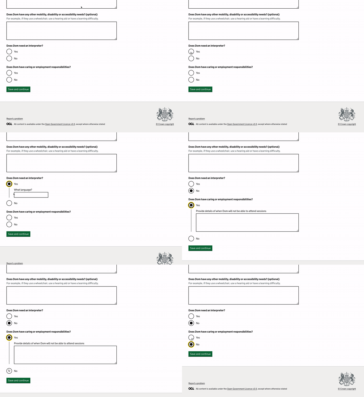
Here’s an example of the conditional radio button that uses JavaScript to show or hide an additional field on the page when the button is selected, so that they only see the hidden content when it’s relevant to them, for example, the interpreter language below.

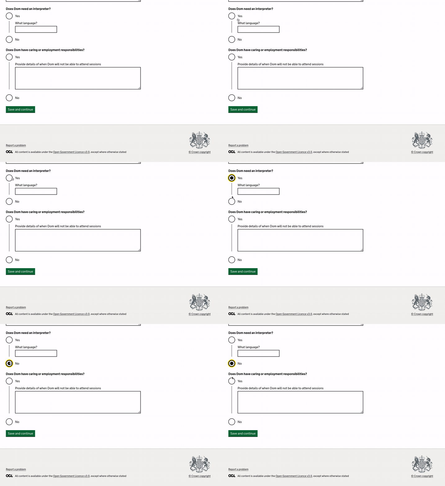
When JavaScript is disabled, here’s how the component is displayed on the initial page load:

What if you can’t rely on GOV UK components?
There are a few places we’ve introduced our own components in Refer and Monitor, ones that require a bit more user input than, say, the conditional radio button above.
One prime example of this is our filters component. We have a long list of interventions users can select from, and we wanted a way of allowing Probation Practitioners to filter this list based on the needs of the person they’re referring.
Although there now exists an MOJ filters component, at the time this hadn’t been tested with users, so we found another component we liked the look of, the Finder Frontend’s “option select”. Unfortunately, this was written in Ruby (our codebase is written in JavaScript), so we couldn’t simply import it directly to our project, or even copy the code across, so we had to build it ourselves. It looks something like this:

Option select uses JavaScript to populate the “x selected” text and run the filtering behaviour itself whenever a checkbox is selected to update the list of results without reloading the page, so there’s no need for a “Submit” button to kick off the filtering process. For users who might not have access to JavaScript, we’d need to provide a submit button to reload the page with the new list of filtered results.
So, we needed to provide 2 versions of this filter component, one that works with JavaScript, and one that works without it. Or did we really need 2 versions?
At dxw, we build a lot of betas that start out as a minimal viable product and iterate from there. Refer and Monitor had a tight fixed deadline for launch since the very beginning of the project so could we really justify building 2 versions of a filter component with this time pressure?
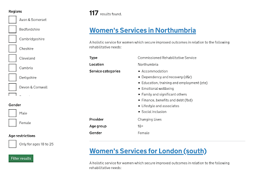
While we could have opted for the better looking, interactive component like the one above, we decided to design and build a simple filter component adhering to the principle of progressive enhancement. It wouldn’t even have the flashy real-time filtering, it would simply be a (perhaps fairly unexciting) list of checkboxes with a submit button. This meant that even if a script failed to load on a page, we’d at least have the pure HTML filter component available for use.
Here’s how it looks:

Now we have something that works for all users, we can iterate on this to add additional functionality and interactivity for users who do have JavaScript enabled. This means we can be safe in the knowledge that there’s a fallback component if something goes wrong.
We could have done all this the other way round using graceful degradation, but then we’d have launched something without the fallback, which may not have been accessible to all users. It could have been de-prioritised and forgotten about in favour of “more critical” core features.
Start simple and iterate
I’ve long been interested in the flashy frontend stuff, animations, interactive behaviour on pages, and until working on this project, I’d never thought too hard about what happens if JavaScript is disabled. On Refer and Monitor however, we’re regularly reviewing designs and asking, “Will this work without JavaScript?”
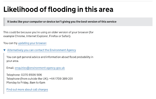
If core functionality isn’t possible without JavaScript, things can get a bit more difficult, and you may have to look for a non-technical solution to make sure your service meets all its user needs. One real life example of this challenge is the Flood Service, which uses an interactive map to display the likelihood of flooding near you.
As this interactive map relies on JavaScript, the non-JavaScript alternative is to provide a means of offline communication with the Environment Agency to get advice about flooding in your area.

Working on betas, time is often short and there’s not always time to iterate on what you’ve built to make it flashier once you have something working. We’ve not yet had time to add the additional styling and interactive behaviour to as many pages as we’d like to, but by starting out simple and iterating from there, we’ve made sure our service is accessible to as many users as possible.
Further reading
A guide about using progressive enhancement on GOV.UK
A blog post about why GOV.UK uses progressive enhancement