What content design means to us

Even though we work with words, we were struggling to come up with a definition so we broke it down into the most important aspects instead
We’ve had a content design team at dxw for a while so we’ve pulled together our thoughts on what it means to us. As we work with different types of organisations, we often have to adapt what we do and how we do it depending on the project, time available, and team.
Our approach to content design
Even though we work with words, we were struggling to come up with a short and snappy definition that neatly summarises the way we work. So we broke it down into the most important aspects instead.
Simplifying language and avoiding jargon
This is pretty straightforward and what you’d expect from content designers in most organisations.
Louise: One of our housing association clients talked about how they did this recently. They have a section on their website called “Problems with neighbours”. They explained that they’d previously called it “Anti-social behaviour” but realised that their residents didn’t use this term when they’re searching the website. Even though “anti-social behaviour” might not seem like jargon, by understanding how their users describe anti-social behaviour, they were able to help them find the right information and avoid confusion.
Creating user centred content
Again, no surprises here. As well as being aware of what a business ultimately wants to achieve, we also need to understand what users need from content and provide them with the right content, in the right format, at the right time.
Louise: A recent Ministry of Justice (MOJ) project I worked on was a good example of changing how we wrote content based on feedback from users. One of the things the probation service do is assess different levels of risk for people on probation, and one of the assessments they use is called risk of serious harm assessment, also known as ROSHA.
As content designers, our advice is to write out acronyms and initialisms in full the first time you use them and add the acronym/initialism in brackets. So when we were getting the prototype ready for testing with probation practitioners, that’s what I did. But it actually made it harder for users to scan this information.
Probation practitioners do extensive training and are used to using a lot of acronyms/initialisms. By writing ROSHA out in full, I was slowing them down by making them read 5 words instead of 5 letters. Lesson learned.
Using evidence, insights, and data
We like to use evidence to shape our thinking and understand how we can create user centred content. This can be performance stats, user feedback, keyword research, interviewing subject matter experts, and basically anything that gives us an insight into the people who’ll be using a website or a service.
Dawn: I’m currently working with MTVH (another housing association) that’s improving its content and moving it to a new website. As part of the work on the repairs section we spoke to staff working in that business area. As well as filling the gaps in our knowledge about the process of reporting a repair, we were also able to find out things like the:
- people who use the repairs service but who aren’t MTVH residents
- important details that residents often leave out when they report repairs
- support that’s available for vulnerable residents
All of which were important to know when we were developing the repairs content.
Creating accessible and inclusive content
When writing or creating content, we need to make sure that it’s inclusive and accessible. That means using accessible language that doesn’t exclude anyone.
Dawn: Here’s another example from MTVH. We’re looking at the form that people fill in if they’re interested in giving us feedback on the designs for new sections of the website. One of the changes we’re going to make is to explain why we’re asking about gender and give people the option to self-describe their gender. This means they’ll understand why we’re asking for this information, and be able to give it to us using their preferred terms.
Using realistic data and information for testing
This is one of the most important elements of content design. We believe that the real world is complicated, so you should use real data in your designs. That means not using “lorem ipsum” or placeholder content that isn’t realistic. Showing the content in the right place in the right format will help your users see how a website or service will work for them (or not).
Louise: I’m going to use another housing association as an example again. When designing their new website, we built a prototype and tested it with different types of users. The important thing for us was not to test if people liked the colours or the look of the website, but whether it actually met their needs. To do that, we looked at things like the top tasks that people went to the website to do, most popular content, and messages that the organisation wanted users to see on the homepage. We wouldn’t have got the same level of insight from customers if we hadn’t created a realistic prototype.
Considering users’ contexts
The context of a project, and who we’re building a website or a service for, is another piece of the content design puzzle. Often, staff who work in an organisation will use language or terminology that their customers or users won’t use, so it’s really important to think about language and how people use it.
A good example of this is Brexit. The Department for Exiting the EU was the government department with responsibility for this policy area but if you were writing content for a website that you wanted the public to find, would you write about “exiting the EU” or would you write about “Brexit”?
Knowing why different groups call things by different names is essential to content design as well as knowing the context of the language and when to use the right terms for the right user group.
Our approach, not the approach
That’s our approach, but it obviously isn’t the only one. What content design/UX writing/content strategy/content creation (or whatever the term is where you are) looks like for you will often be shaped by things like:
- what you’re working on
- your organisation’s context and its level of digital maturity
- the resources and tools available
- the structure of your team and the way it likes to work
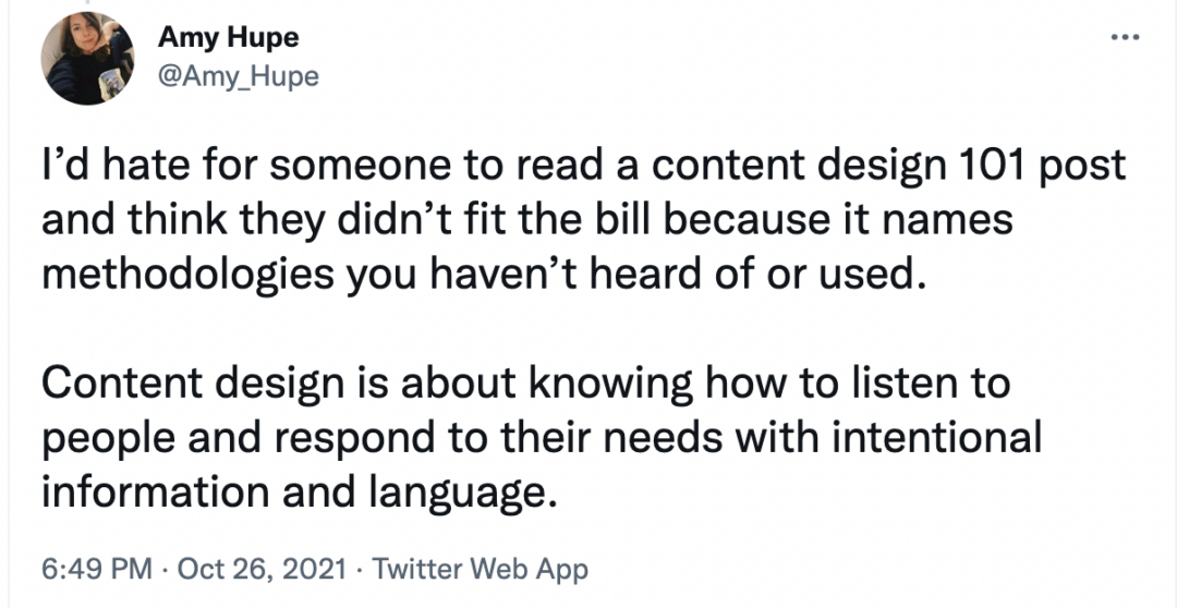
But, as this tweet from Amy Hupe says, the fundamentals of content design are always the same:

[Image description: “I’d hate for someone to read a content design 101 post and think they didn’t fit the bill because it names methodologies you haven’t heard of or used. Content design is about knowing how to listen to people and respond to their needs with intentional information and language.”]
And if design principles like GOV.UK’s are the basis for what you do and how you do it, you won’t go far wrong.