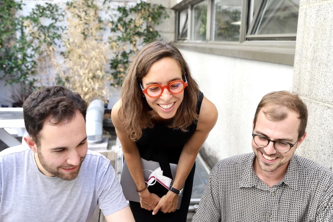
Maybe the real design tool was all the conversation we had along the way

Conversation is the most overlooked design tool we have
I am old.
I first began studying as a designer in 1994, on a National Diploma in Advertising Design at Wigan College of Technology. For the first of those 2 years, we weren’t allowed into the IT room with its suite of (beige, pre-iMac) Macintosh computers, invested in by the college to help students navigate the burgeoning field of ‘desktop publishing’.
The only design tools we were allowed to use to create our designs were bleedproof paper, Magic Markers, and Letraset books (not actual Letraset transfers, that would have cost money… If we wanted a specific typeface in our designs, we had to use mechanical enlargers and lightboxes to trace each character with our constantly-jamming-and-leaking Rotring pens).

When your design outputs are fully analogue and you don’t have the luxury of unlimited cmd-Z, you quickly develop a habit of making sure you are on the right track before you commit to paper. This is when we first learned the value of talking about our design work. We got good at making low-fidelity sketches (‘scamps’) that would fuel critique sessions. We practised giving and receiving feedback, developing the confidence to share opinions that might tread on toes, whilst thickening our own skins to the spiky opinions of others.
We learned how essential conversation was to the design process.
An Apple all day keeps the discourse away
In our second year, we were finally granted access to the Macintosh room. It’s entirely accurate to say that from the first day, we spent a lot more time learning how to use the shiny new tools at our disposal than we did talking about our design decisions. Our outputs may have looked more “real” but we spent a lot more of our time working on them in isolation from each other. The discourse disappeared and we became more individualistic in our-day-to-day work.
Learning new tools became a large part of the process and, to some degree, it stayed that way for the next 3 decades. Honourable mentions for some of the fallen: QuarkXPress, Aldus Freehand, Freeway, Fireworks, Director, CSSEdit, Coda. Flash… you were fun in the beginning but we didn’t know just how much we’d come to hate you.
The ‘net’ effect
It would be daft to not have some words about the effect of the internet on design tools and conversation. 20 years ago the world wide web was evolving much faster than software design was, so we used our ‘old’ tools (with some small evolutions) to design for this new medium (if you ever sliced a Photoshop file for use in an HTML table layout, I’ve got hugs for you). Eventually software caught up and the cloud-based tools of today are literally beyond the dreams those of us at the coal face 2 decades ago.
Through all of this though, we still had conversation as our constant. The internet gave us new ways to talk about design too. For example, I know I’m not alone in fondly remembering the good old days of Design Twitter, and the golden age of blogging, and the days where comment threads were actually positive and supportive (or is that just my rose-tinted specs?). A proliferation of online tutorials helped us to learn and share new techniques and hacks (stares daggers at Internet Explorer). My own personal favourite design memory from those halcyon days was getting home on a Friday evening and sitting with a beer watching the week’s Layer Tennis match unfold.
And nowadays of course many of us are more likely to be using the internet to talk to each other about design than we are to be leaning around our monitor to chat to a colleague.
Enough reminiscing, time for some bullet points
Almost 30 years later, I still firmly believe that conversation is the most powerful and overlooked tool we have at our disposal in the process of designing things. Here are a few reasons why:
- Conversation democratises the design process like no app can. Not everyone can make a rectangle responsively grow and shrink in Figma, but your multidisciplinary team colleagues, clients, and stakeholders all know how to have a conversation about whether that rectangle might deliver value to your users. The very act of talking about design demystifies it, and turns it into a participatory process. By the way, if you’re reading this and you think having those pesky clients and users participating in your design process is a terrible idea, please go away.
- Conversation can act as a leveller – it should be as accessible to your most junior colleagues as it is your most senior. Obviously, explicit hierarchies and implicit power structures come into play everywhere to affect this, and it’s probably my weakest supporting argument in this piece, but here we are.
- Conversation is incredibly interoperable. There are myriad ways to ‘import’ and ‘export’ words from one brain into another without having to worry about being on the same account plan, or equivalent version number. You probably speak the same language as your colleagues in your current job. You’ll probably speak the same language as your colleagues in your future jobs. Interoperability of design software is a virtually extinct problem in this cloud-based era, but you can ask your grandad for his war stories about the horror of bundling up the various ‘right’ artwork files for repro houses.
- You’re likely already proficient in conversing with others. You’ve probably been doing the very basics since before you could walk. Can you say the same about Figma?
- There’s no complicated and ever-changing subscription model to having a conversation. ‘Talking to others’ will never be acquired and shuttered by Adobe (I hope).
- Finally, and perhaps my favourite reason that conversation is the best design tool: you don’t have to worry about getting moaned at for not naming your layers
You can talk to me
There are folks who might consider conversation one of the ‘soft’ skills, but the hill I will die on is that conversation is the true backbone of the design process. No artefact you can produce in any design tool means anything unless you can talk about the decisions that went into making it.
I believe that most folks reading this piece will think ‘Gaz, this is obvious stuff mate’ — and that’s ace. But if that’s not you, please try this experiment: for a week or two, make an extra big effort to treat conversation as your primary design tool. Try to think of the outputs of your usual tools as assets whose true purpose is to support those conversations.
Lastly, talk to me! I’d love to hear your thoughts on any of this, even if it’s just having a nostalgic conversation about tools you’ve loved or hated (but please, not browsers).