
One of the most valuable outcomes from this work was facilitating opportunities to get the right people in the virtual room together
We worked with the Ministry of Housing, Communities and Local Government (MHCLG) to understand and map the UK’s planning system
The Department wanted to understand the reality of the planning system as a whole, so it could identify the pain points and how different systems interconnected and impacted one another.
Outcome
Our work helped MHCLG become more informed and connected by seeing the dependencies between different systems, more empowered by the use of visuals to make good decisions, and more in control by enabling people to engage with information at a level of detail that worked for them.
“I’d recommend you for anything quite complex – the fact you got to grips with the planning system in 18 weeks which isn’t much time to produce the amount of stuff you produced.”
Dr Jen Manuel
Representing how these systems work
This project was about communicating complex systems and presenting our research and user insights back to the Department. We produced a series of tools, insights and resources that MHCLG could draw from to build their understanding of the problem spaces and help influence and inform future decision making.
We recognised quite early on that the planning system was a web of interdependent yet intrinsically connected small systems. This can make it difficult for teams to understand the whole landscape and how changes to the planning system might have a knock on effect on various wider working systems.
We produced a number of outputs, all driven by user and stakeholder insight or research. The outputs included a set of interactive personas and policy insight cards, a story map framed from the perspective of a piece of land travelling through the planning system, a set of typology data driven insight cards and a roll out timeline focused on a potential to-be sequencing of reform plans.
Our approach
This work took place in 2 phases. Phase 1 focused on generating an understanding of the planning system and playing back how proposed reforms might impact users, various planning teams, and communities. Phase 2 focused on consolidating information and creating tools to help policy teams think about unintended consequences and help them make good decisions.
Like any user-centred project, we began our work by speaking with users and experts in the planning system. This included local authority Planning Officers, Developers and Statutory Consultees e.g. the Environment Agency. This gave us a view of the practical experience of planning policy and guidance vs a theoretical understanding of it.
The main thing we achieved was to help the Department absorb, understand and connect lots of complex information so they could communicate it in ways that made it easier for policy makers and stakeholders to have constructive discussions and make more informed decisions.
Below are 4 examples of how we did this:
1. Communicating interconnectedness
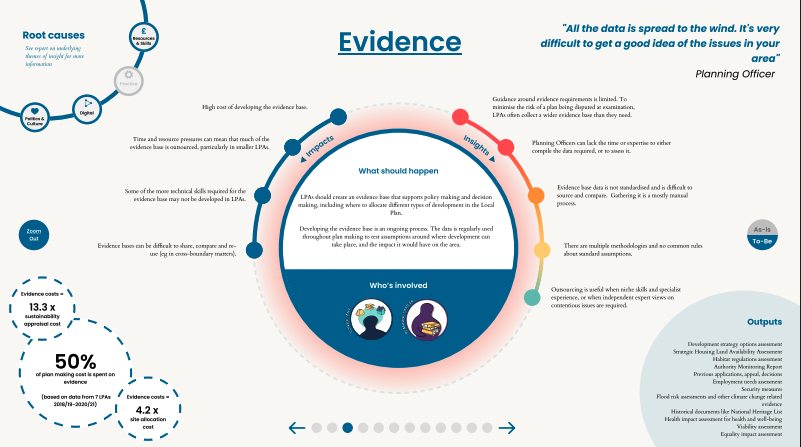
To help communicate the interconnectivity within the planning system, and help teams visualise the whole planning landscape, we created an interactive ecosystem tool. This tool was made up with a set of 24 ‘Chapter Cards’ – each card showed a deep dive view of parts of the planning system (such as environmental impact assessments, local plans, evidence), and explored insights into pain points, successful experiences, data points, impacts and root causes.
The tool allowed users to zoom in and out to different levels of detail, move between connected systems, and start to visualise how different aspects of the planning system worked together towards an outcome.
2. Choosing a different central character
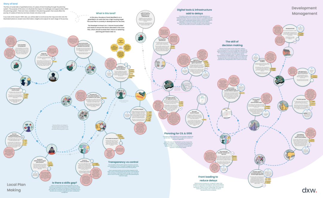
The complexity of different roles, processes and potential nuances within the planning system meant it was difficult to fully represent dependencies, frustrations and potential risks across a user journey. So we defined a story where the central character was a piece of land.
This enabled us to show how users, policies and systems impacted that piece of land on its journey towards becoming a new building. It also served as an opportunity to summarise the most common pain points, touchpoints and dependencies.
3. Showing the bigger context
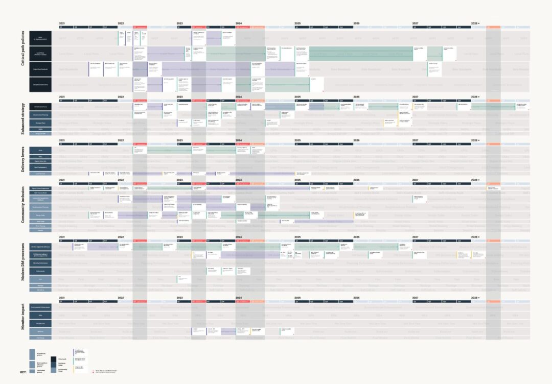
Part of our second phase of work focussed on further detailed research with each policy team to understand their reforms and plans for implementation. We brought together 50+ people from planning policy teams to review and discuss their current individual implementation plans. We asked them to review their plan in the context of other policy areas’ timelines. For some, this was the first time they’d seen their plan in the broader context. It helped the whole team to spot where:
- things wouldn’t align
- dependencies would fall down
- users would struggle with too much change, or too little time for change
4. Using data to communicate the impact on users
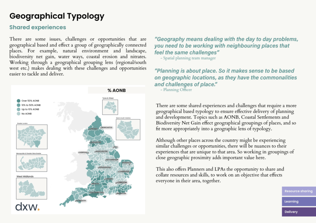
We wanted to support MHCLG in understanding how proposed reforms might impact communities and users, and discover they might be able to identify areas across the country where additional work, support or care might be needed.
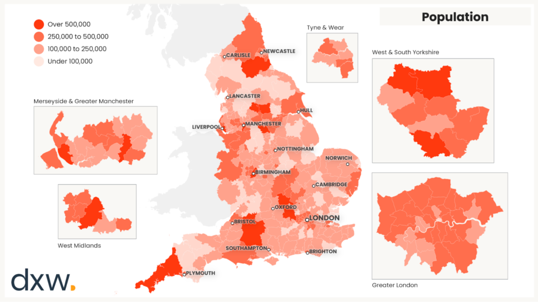
Using readily available data about England such as; population, job density and green belt presence, we produced a series of maps showing different environmental factors across the country. We combined these data maps with user insight and research findings to bring to light the impacts reform might have on areas with these environmental factors.
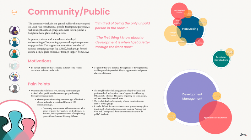
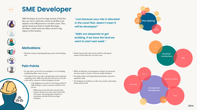
Similarly, in phase 1 we created a series of user personas to visually communicate the experience different users have of the planning system, their view of individual systems, and where the reforms might impact them most.
Lasting impact
Ultimately one of the most valuable outcomes from this work was facilitating inclusive and engaging opportunities to get the right people in the virtual room together to have open and transparent conversations. For many, this was the first time they’d ever spoken to these other teams, or had a chance to get into the details of their plans.
Working collaboratively with policy teams, and providing visual tools to support decision making meant they were able to continue working in this way once the research phase concluded.